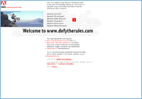
Method
builds up this extraordinary site on a base contradicting
to all means of restrictions in the mind of a conservative web
developer. Instead of abusing the media in terms of interactivity
Method utilizes Adobe's site to show the possibilities of
creating a user friendly (though very target audience concentrated)
interface which pushes the technical limits of a dynamic
website in a way that enriches the viewing experience.
A slight step, into something out of the regular, has been taken
by the designers. The recognizable Adobe graphics have lost some
maturity and strictness which helps out in the process of making
the visitor eager to explore the whole site.
October 14, 1999|Layer 2/2
In an era when flash
has broken every barrier of being unique, and has turned ubiquitous,
a site like this has a strong communicative potential. The fact that
the entire show is presented without leaving the actual document
shows that there are other roads than the Macromedia highway
that lead to the same solution. Putting in mind that this all is a big
commercial for Adobe software I'd like to applause. They really
managed to keep me stuck there till they were done telling me their
message. The purpose of the site is to keep the visitor up to date
on what can be created with their "amazing" products and I did read
every line of the content because of the extremely interesting way
they put it in. Though this might not be suitable for everyday sitework
it is still an excellent exhibition of what we'll see more of in the future
when the common man has geared up with enough bandwidth, plugins
and browser versions needed to make a surfing experience like this possible.